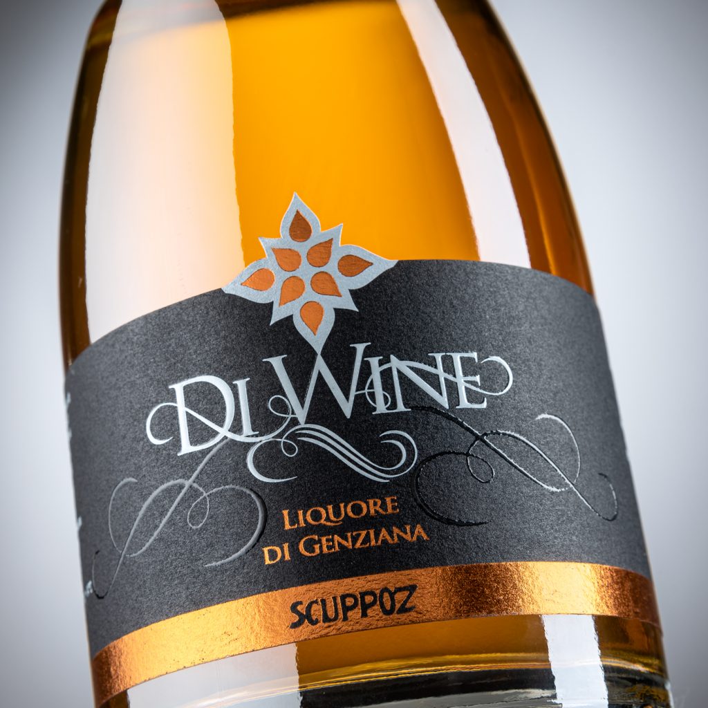
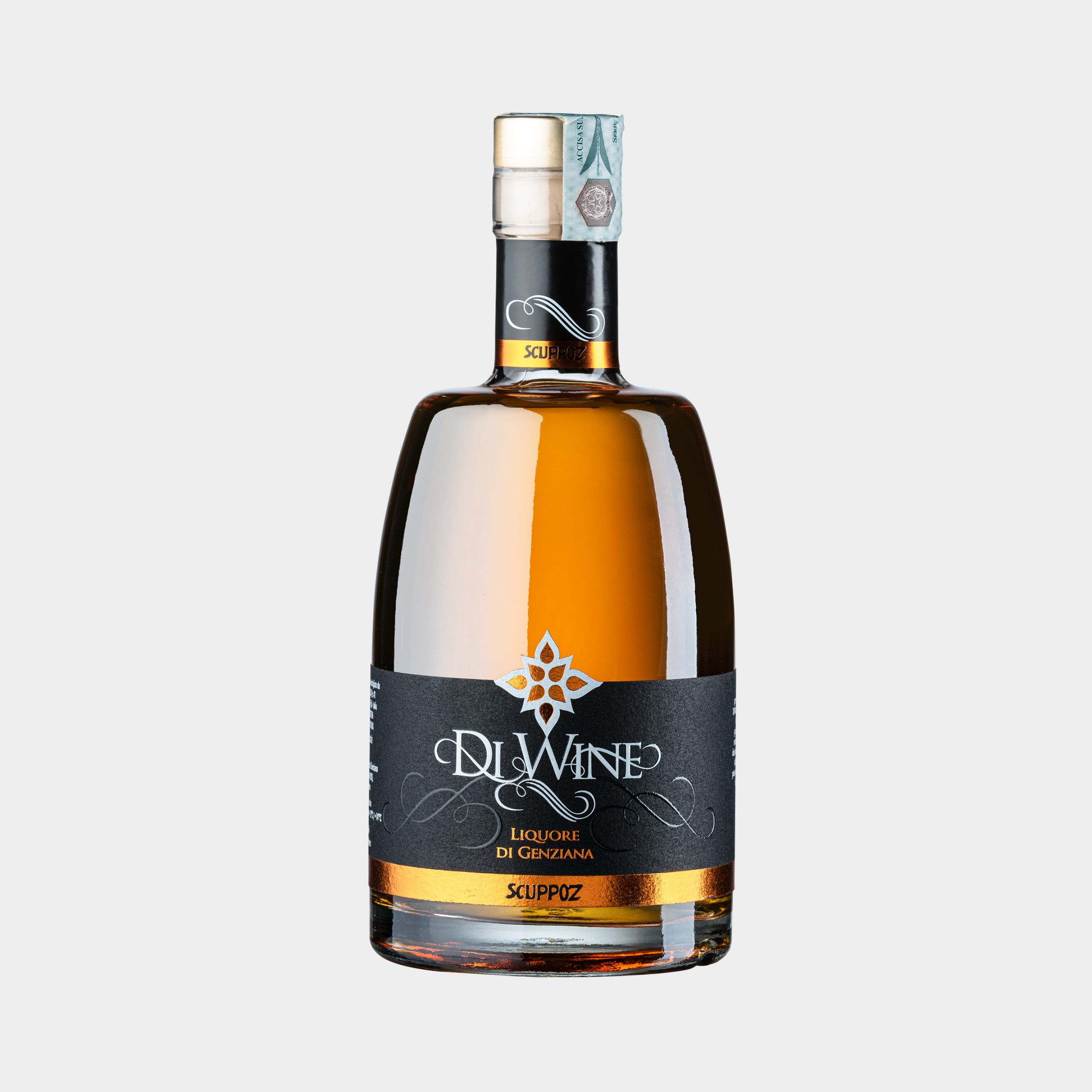
The design of the flagship product of Scuppoz arises from the need to give a more modern twist to a liqueur coming from the ancient tradition of Abruzzo, the wine-based gentian (hence the name “DiWine”). Drawing inspiration from some base graphic elements (like the shape of a drop), we put our focus on sketching a gentian flower standing out in the foreground together with the lettering which, with its ornamental typeface, recalls an essential element of the product, the roots. The finishing touch is the application of bronze foil on black paper, which visually conveys its high value and its quality level matching with what the product itself communicates in the mouth.